Design a site like this with WordPress.com
Get started

The Aliens We REALLY Don’t Want

A few stories over-shadowed by the big ones ( pandemic and social unrest due to racial issues) have caught my attention in the past month or so. Stories about immigrants, of good and bad sorts. It makes me think the U.S. has the right issue but the wrong targets.

My sweetie loves Youtube videos about decorating and crafting and one favorite of hers is a young guy who makes, well, somewhat over-the-top centerpieces, mantel decorations and wreaths using dollar store goods. He’s called Ramon at Home, and even if I don’t share his enthusiasts delight in all his lavish designs and all things burlap, I must admit the young man is quite charismatic. He has a strong Hispanic accent, and he shared a story of how he grew up poor in Mexico and looked forward to nuns coming around with such simple gifts as new toothbrushes and toothpaste. He came to the U.S., taught himself English and now seems to have a beautiful house and thriving online community following him. Lately he’s been spearheading a campaign to get children’s clothes and hats for low-income kids at Christmas. It’s hard not to be inspired by that or get behind a person like that. Of which there are so many in the land.

So it surprised and pleased me to hear of George W. Bush’s upcoming book. Out of Many, One is going to be a book of portraits painted by the former president; 43 different immigrants accompanied by essays he wrote about them. It’ll be his second book of paintings, coming after Portraits of Courage, pictures of U.S. military personnel he painted. You can take that – a book celebrating immigrants to the country – how you will in terms of the commentary about the current government and its policies. Bush says “there are countless ways in which America has been strengthened by the individuals who have come here in search of a better life,” and adds “it should be (an idea) that unites us.”

Right you are, George… and I wouldn’t have guessed I’d be saying that about Mr. Bush’s writings or beliefs about 15 years back. There are stories in the news though that do suggest America has a real problem with immigrants… just not the kind Washington is worried about. Invasive species.

When environmentalists talk, lately “climate change” gets the attention. The spotlight and the hand-wringing and the sparse money that is to go around to implement change is directed towards what Al Gore referred to earlier this century as “Global warming.” But it seems like a number of unwanted visitors are ruining our environment and country a lot faster than a few added degrees on the thermometer ever will.

To start, more Asian hornets have been found this year in Washington state and nearby B.C. in Canada. The giant wasp dubbed “murder hornet” by the media showed up in a few locations last year, found noticed when beekeepers near Seattle and Vancouver found some hives decimated. The 2” long hornet has one of the most powerful stings of any insect, and is said to kill about 50 people a year on average in Japan.

This is disturbing. I have allergies and am at risk around stinging bugs. So too are an increasing number of people. In fact, an average of 62 people a year die from stings in the country annually, and that number has begun to rise sharply in the past decade, according to the CDC. People worry about sharks when they swim or rattlesnakes when they go walking but bees and wasps kill several times more people than those critters combined. An even bigger, more dangerous wasp isn’t going to help that any!

Experts add that the Asian hornets aren’t aggressive… unless you stumble upon their nest… which people undoubtedly will, since they bury their nest underground rendering them more or less invisible until you step on it. But even if their non-aggression is the case, they are concerned that the hornets have a real taste for eating bee heads like we might snack on popcorn. A single one can eliminate a hive of honeybees within a few hours. The repercussions for agriculture could be monumental should they get a foothold, even if only along the Pacific coast.

One of the reasons the number of people being rushed to hospital, and at times dying, from insect stings is a similar story. Although “yellow jacket” is essentially a rather non-scientific generic term for a number of wasps, the ones we usually mean when we say “yellow jacket” – the ones which menace our picnics and have never met a beer or soda they don’t like – are actually European ones brought into the continent in the 1970s. Maybe they came over on ships or planes accidentally as the Asian hornets likely did; maybe some misguided farmers imported a few to try and control other bugs (when a yellow jacket can’t find some McDonald’s or Miller to share with you, they’ll happily chow down on other bugs including smaller wasps). One way or another they started showing up in the Great Lakes region in the mid-’70s. Now they’re considered a major pest as far afield as the towns of Dixie and the Canadian Rockies.

Stinging insects aren’t the only unwanted six-legged intruders. Spotted Lanternflies have been, well, spotted, in Pennsylvania this year. It’s an Asian moth which actually looks quite attractive. But, says the state, if you see one, “it’s imperative to immediately report it (and) kill it! Squash it! These bugs will lay egg masses of 30-50 eggs each.” The adults will not only enourage poisonous mold to develop on the plants, but also eat the leaves and can destroy fields of plants including grapes, apples and hops.

You won’t confuse the spotty moth with another recent Asian arrival – the Ash Borer. That colorful green beetle from Eastern Asia recently showed up in the northeast around 2002 and has managed to do some $280 billion damage so far. “An ecological catastrophe,” the American Forestry Association calls it. The beetles lay their eggs exclusively under ash tree bark, and when the larvae come out, they feed on the wood, quickly killing off the tree. Entire forests of ash trees from Quebec to Kentucky have been wiped out already. Ash is not only one of the most common types of forest tree in the East, providing homes for many birds and animals, it’s a popular shade tree in gardens and commercial one used for lumber (and baseball bats.) One of the suggestions to control them is – I kid you not – to bring in more, different Eurasian wasps to see if they can, because North American wasps aren’t eating them in any appreciable number. More foreign wasps? What could go wrong there?

Of course, the problems aren’t limited to insects. Florida is having to wage war against … pythons! Someone probably had a few Burmese pythons at one time as pets and perhaps thought they were getting too big. They dumped them in the Everglades. Within the past two decades, they’ve multiplied and spread throughout the southern part of the state, growing precariously close to the 26-feet, 200 pounds they can reach in their native southeast Asia, eating almost anything that gets in their way.

While attacks on people are rare, they’re not unknown (and expected to become more common if the numbers keep growing and they invade places like Miami and Orlando in any significant numbers), they’re doing huge amounts of damage to the ecosystem. The babies eat rabbits and rodents, but the adults can eat animals as large as deer! The state says since they’ve been found in Florida, there are 99% fewer raccoons and opossums in the Everglades and adjacent areas, 87% less Bobcats (probably as much because the pythons are eliminating the cats’ food as much as eating the Bobcats although that can happen as well) and lowering bird populations while rabbit and fox populations have almost disappeared. They spent $142 million last year trying to get rid of them, both by directly trying to catch and euthanize, as well as implant radio devices to track them and hopefully root out nesting sites and colonies of the huge reptile. Even though snakes have no legs or arms, so far, it seems the pythons have the upper hand. Although Wild boars, yet another invasive running wild, do sometimes manage to tear them up… along with anything else in their path, plant or animal.

So yep, seems like there is a problem with some unwanted foreigners coming into the country. Only thing is, they’re generally winged, or scaly or furry, not people.

Boffo Beer Blog #17 : King Grackle Has Surely Come

I’m back with a new beer to take out for a flight…Texas Beer’s King Grackle Stout. As I’ve noted before, I like birds and so this one was a “must try” for me. And decidedly Texan!

For those who aren’t familiar, grackles are blackbirds, long, slender, social and shiny. where I came from (as well as much of North America) there’s the Common Grackle, a noisy bird a bit bigger than a robin and a sure sign of spring when they return in March. As they say though, “everything’s bigger in Texas” and here we host the Great-tailed Grackle, a much larger version of the regular ones and one of the biggest songbirds on the continent. And boy do we have them! They nest around the cities but in winter, they’re joined by their friends and cousins from the colder states and congregate in flocks that can number in the thousands, often in trees around shopping areas. They’re bold and eat almost anything and are thus successful…and like most animals that thrive in urban areas, the locals by and large hate them. But I always find them colorful, enjoy watching them fly out of nowhere to chase a passing hornet and am in awe of their synchronized twists and turns as the flocks get ready to settle for the night. Cities like Dallas, Austin and Waco have the biggest numbers of them anywhere.

So we have a bold, quintessentially Texan bird which is mostly black in color. Fittingly, the beer named after it is dark and bold as well. The brewery describe it as “a full bodied stout that flies boldly above the flock.” They note that it’s “bold and flavorful” with “notes of coffee and chocolate.” Which might sound unusual but actually is typical of European stouts and could pretty well describe Guinness too.

The Texas Beer Co. is a relatively new addition to the roster of craft brewers around the state, starting up in 2015 with the help of a Kickstarter fund as well as private investments. They built their brewery in an old brick building in Taylor, not far from Austin, and like many others, have a Taproom on site which offers trivia nights and live music in non-pandemic times! Among their popular brews are a blonde ale, a Hoppy Duck IPA and Pecos Amber, a beer which took a gold medal at the 2018 Great American Beer Festival.

For my try, I popped open a 12-ounce can (suitably dark and adorned with a picture of a Grackle) and poured it, noting its similarity to Guinness in appearance. It was almost black in color and produced a tall, creamy caramel-colored frothy head which lasted some time. I had it with a toasted ham and tomato sandwich lunch with some cut-up green tomato (unfried) on the side.

My first impression was that this is a strong drink. Strongly-flavored with a foamy head that actually retains a bit of texture when drunk. It is bitter, but not displeasingly so and rather hoppy. I could detect just a hint of chocolate in the mix (they actually use some cocoa brewing it) and although it didn’t taste precisely like coffee, it did evoke a bit of a feeling of a cold, strong black coffee. Thankfully, I like black coffee.

As it might be assumed, it held its own with the meat sandwich and the tomato (green tomatoes , by the way are quite meaty and less “sweet” than most typical ones). It actually created an odd little “zing” when washing down the sandwich and had a nice silky, creamy kind of feel. Substantial was a word which came to mind. The chocolate hints and strength of it make me think it would go well with a real coffee over a sweet pie or ice cream dessert as well. But at over 7% alcohol (the can says 7.5% but their website claims 9%) it is a brew for enjoying when the day is done. You’re probably not going to be flying energetically after downing one.

Overall, I like it for times when a drink with a bit of kick and intensity feel right. It might not be my everyday choice for cooling off with or having while watching a couple of innings of baseball, but it’s one I might just keep on hand. I rate it 7 out of 10 for strength, 7 out of 10 for flavor and

grackclipgrackclipgrackcliphalfgrack

3.5 out of 5 king grackles!

The Cat That Sold Train Tickets. It Was A Simpler Time.

The art and science of marketing fascinates me and I like visual arts as well. So corporate logos interest me; the things that go into making a public image that will sell a company’s products. Often there’s a lot more to them than first meets the eye. Many know for example, there’s an arrow in the Fed Ex logo in the negative space between the “E” and the “X”.

fedex

An arrow suggests moving quickly doesn’t it, and that’s what you want your package to do!

Cisco computer systems in based in San Francisco (as the name suggests) and if you look carefully at the lines above the name, they suggest the outline of the city’s most famous structure, the Golden Gate Bridge:

cisco

Toblerone chocolates are from Switzerland, so it’s no surprise they have a mountain in their logo. What is more surprising is that they are from Bern, Switzerland specifically and that means “bear.” And if you look closely at the mountain…

toblerone

Look at that bear walking in front of the mountain!

I like trains and cats too. Bet you think we’re getting near a Dr. Seuss story by now, don’t you. Actually we’re not. But there is an example of the three – trains, cats and corporate images – intersecting. No wonder I liked the Chessie System railroad so much.

Chessie was a 1970s railroad that resulted in the merger of two large railroads – the B&O and the C&O (yes, the same two you find in a Monopoly game) – and one short line, the Western Maryland RR. It ran freight trains all across the northeastern U.S. (and a single line cutting into southern Ontario in Canada for a few years) and while most of their competitors favored somewhat dull-looking black and white engines and brownish freight cars, Chessie sported lively navy blues and yellow. Their locomotives were neon yellow with an orange stripe and dark blue top, with the name in large, ever-so-’70s Bahama font on the side. They looked great running loads of coal through the Appalachians and even got a starring role in a music video, strangely enough (R.E.M.’s “Driver 8”).

chesloco

If you look closely though, the “C” in the Chessie System, you see the letter is sort of cut with a couple of points. Well, if you look closely and kind of squint, the “C” is holding the outline of a cat’s head and front paw. That cat is “Chessie.”

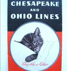
Chessie was a kitten that was used in the era when travel by train was the way to get around. Before air travel became cheap or readily available in most places, long trips were undertaken on the rails. And long before the government-sponsored Amtrak, various rail lines competed hard for the travel dollars and advertised extensively, using posters and ads showing the glamorous destinations mostly. The C&O were among the first railroads to get air conditioned cars, and somehow came across a picture by an Austrian artist. It showed a contented-looking kitten sleeping with its head partly covered in a pillow and one paw sticking out from the sheets. They bought the image for all of $5 and ran it in ads saying “sleep like a kitten and wake up fresh as a daisy” when traveling on their trains.

chessiekat

A picture of a sleeping kitty cat might not lure you into booking your next trip between New York and Chicago on a particular railroad, but it was a simpler time back in the 1930s. A couple of decades later, a sexy girl in a bikini might have been the ad attraction, now a multi-racial, multi-generational family laughing around a kitchen table together. But back then, people loved the ad and passenger numbers increased on the C&O after it was used. So popular was it they even published a calendar using the kitty the next year and sold thousands. Take that, Sports Illustrated models!

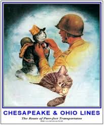
The mascot, or mas-cat, needed a name so they chose “Chessie”. After all, the “C” in C&O stood for Chesepeake, as in the bay. The O was Ohio, by the way. They ran more ads and, rather like some of our modern corporate spokespeople have (think Flo for Progressive) Chessie took on a life of her own. In time, she grew up, met a tomcat (“Peake”) and had her own kittens, “Nip” and “Tuck.” When WWII came up, Peake went off to war and Chessie stayed home selling War Bonds for the lads overseas. And cats overseas, as it were.

chessiewar

The cats remained popular mascots for years, but eventually passenger trains began to lose their lustre, and eventually were all taken over by one entity, Amtrak. C&O and the likes concentrated exclusively on freight traffic, which required less advertising in mainstream magazines. Chessie was more or less retired. Until the C&O and B&O, with their similar paint schemes and often parallel rail lines decided to merge. They formed the Chessie System railroad, and needing a new corporate image, they resurrected Chessie the cat, but only in the sillohuette superimposed on the large “C”.

chessie cab

The rail line was a favorite of photographers, model railroaders and apparently Michael Stipe of R.E.M., but as is the way with large corporations looking for efficiency, by the ’80s, they in turn had merged with another southeastern railroad, the Seaboard Coast Line to form a corporation unimaginatively called “CSX Transportation.” The company retains the Chessie colors but lacks the kitty design although they say officially Chessie the Cat is still their company mascot. However, repainting entire rosters of thousands of engines and boxcars isn’t always a transportation company’s top priority, if you keep your eyes open you might just spot ol’ Chessie rolling by at the level crossing now and then.

So there you have it – a time when a kitten was the “cat’s pyjamas” for a railroad. Not too important, but just an interesting little story of an America of days gone by.

Judging A Book By Its Cover

They say “you can’t judge a book by its cover.” But we writers know differently. People do exactly that, so you’d better be able to judge a book by its cover… and quickly.

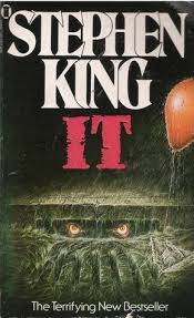
It’s always been an issue for authors and their publishers. Unless you’re a household name with a stack of New York Times best-sellers to your credit, people will take a quick look at your book in the store and decide from that cover whether it’s worth even picking up to read the slipcover, let alone purchase it. So your book needs to have immediate visual impact, and suggest to the newcomer just what kind of book it is. Take a look at these examples:

sking

Granted, almost everyone who ever sets foot in a Barnes & Noble, and most of those who don’t, know who Stephen King is now. But even if that weren’t the case, it wouldn’t take a lot of imagination or guesswork to figure out from the cover that this wasn’t going to be a cheery work designed as a lullaby in print! And, since King is so well-known, note how his name takes up about half the cover. When you’re that successful, your name alone will lead to sales.

Contrast that to this one:

egif

Although it would soon be made into a successful movie, when it came out, Emily was an unknown author. But the cover made for a quick suggestion as to what it would be about and its character. We’d have been quite surprised to find it about a deranged super-natural clown, wouldn’t we?

People do judge a book from its cover. It’s always been true but now is more so than ever, as much of the browsing is done online. Now instead of a 7X10” book sitting in front of them, readers make their choice increasingly by looking at a stamp-sized image on a screen. That thumbnail better have something to make them interested right away.

It was a problem confronting me when I put out my debut novel, Grace…fully living. While my dad, ever the cheerleader, would probably have told me to be confident and go the Stephen King route and have my name take up half the front, I realized outside of a few dozen Facebook or Twitter friends and my little circle back home, no one knew me from Adam. Visuals would have to do the selling.

So, I needed something to catch people’s eye, tell them the book was a light-hearted one about a young woman…and be within my relatively small budget. For that, I find Pexels is one of the best sources of stock images.

My first cover, on the initial e-book release, was this:

gracenewsmallcover

The photo was taken by a Toni Cuenca and I loved it. It was bright, it was colorful (even more so after I tweaked it in a photo-editing program), it said “fun.” The model was attractive, and a redhead, as Grace is in the book. I chose bright summery fonts.

I thought it was great, to be honest, but my sweetie didn’t. Now, it is my work and my choice, but it was worth considering. She was a lady of approximately my target audience and she didn’t seem to appreciate the cute girl in a swimsuit. If she didn’t, many other women might not either. Not to mention, it had no direct tie-in to the book other than the redhead and the easy-going feel. And the proof was in the pudding. Initial sales were low to say the least (not that I expected it to be a million seller no matter what was on the cover!)

I put it out last summer, and decided to try and reboot it and spark sales late in the year by putting it out as a “Christmas edition.” It wasn’t altogether too cheesy an idea as the book begins and ends at Christmas. I added in a little bonus content and changed the cover to this one. The image also came from Pexels.

cmaswrapping cover_small

It was cute. My very small focus group of women seemed to prefer it to the first one. It made an appropriate lead into the start of the story… young woman, Christmastime, cold area, looks like she might be happy enough. But for the new cover and few extra pages, it didn’t fly over the internet into a lot of Kindles.

So when it came time to actually get a small run of the book printed this year, I wanted a new look for it. The hot chocolate cover wasn’t going to cut it, since it might give a hint that it was a romance or comedy, it screamed “Christmas!” with the image and all that red and green going on. Which might be good come December but is going to torpedo summer sales.

Again I looked at Pexels and found by Thiago Schempler. I liked it for several reasons. It’s simple, it’s sort of upbeat looking and it could easily have been a part of a few scenes in the book. The model looks casual and happy, and her hair obscures her face somewhat, leaving a little room still for the reader to imagine Grace as they like. And it was fairly basic in image and colors…more so after my digital tweaking of it. There was space to add in the title without covering essential parts of the picture and, without too much detail, it translates quite well when reduced to phone thumbnail size.

grace resize cover

It’s not pushed the book onto bestsellers lists or bought me a new Ferrari (not even a diecast one!) yet, but I think it works. And I thought you might like to get a feel for one of the myriad of things that go into being an author besides the “simple” writing a book!